
How to Choose Colours for Your Business: Everything you need to know
- Alisa Salter
- Sep 9, 2025
- 7 min read

Contents:
Choosing colour for your brand may seem easy, but moving from theory to a usable palette involves several deliberate steps.
Identify Your Audience and Position
Colour is one of the first things people notice about a brand. When it comes to choosing your palette, you must first answer the fundamental questions “who am I speaking to?” and “what do I want my brand to mean for them?” That matters: 16% of consumers say the first thing they notice about a brand is its colour scheme, and half of consumers—including 51% of Gen Z and millennials—have chosen one brand over another based on colour alone.
Colour Psychology
For many, colour can drive buying decisions—research suggests it influences up to 85% of shoppers’ choices, and lifts brand recognition by as much as 80%. On top of that, ads in colour receive 42% more views, while red call‑to‑action buttons have boosted conversions by 34%. All of which makes one thing clear: colour is a strategic tool, they tap into emotions and behaviour.
Red
Red provokes immediate emotional responses—it’s high‑arousal, often linked to energy, urgency and boldness. It grabs attention and can stir both excitement and tension.

Coca-Cola
Coca‑Cola leans into red to convey joy and optimism. Its red packaging and branding drive impulse and emotional connection. Coca‑Cola’s festive iconography, like the glowing red delivery trucks and Santas in its Christmas campaigns, further reinforce warmth and nostalgia. Over time, these visuals have helped the brand embed itself into the holiday season, turning Coke red into a signal of celebration.
Netflix
Netflix’s bold red logo aims to match the company’s storytelling edge. The vibrant red signals energy, passion, and momentum, mirroring the drama and emotion of its content. Paired with a dark background, the red logo stands out and feels cinematic, which is perfect for a platform built around immersive viewing.
Blue
Blue, on the other hand, is calm, trustworthy and intelligent. In public polls across the US and Europe, blue is the most popular colour overall, tied to harmony, confidence, knowledge, and concentration.

Facebook chose blue for good reasons beyond branding trends. Its founder, Mark Zuckerberg, is red‑green colourblind, and blue is the hue he perceives most vividly. Over time, the blue palette has come to represent the site’s reliability, calm environment, and connection-building function.
American Express
American Express uses deep blue to anchor its brand in trust and stability. Its “Blue Box” logo is instantly recognisable and sends a clear message of reliability, whether on a card, app or ad.
Green
Green carries layered symbolism. In Western markets, it often signals nature, renewal, health and calm—its associations rooted in evolution and the environment. It carries a sense of balance and tranquility, often used to project comfort and wellbeing. Yet green also has less flattering associations—jealousy (“green with envy”), inexperience (“greenhorn”), illness (“green around the gills”), so its meaning shifts depending on context and culture.

Starbucks
Starbucks uses deep green as its signature colour to convey growth, freshness and environmental mindfulness. The hue relaxes, signals quality, and reinforces the brand’s roots in coffee culture and a calm café experience. It supports the impression of a grounded, approachable brand, focused on sustainability.
John Deere
John Deere’s iconic green-and-yellow palette centres on green to reflect its deep connection to agriculture. The green symbolises fields and growth, while the yellow nods to harvest and productivity.
Yellow
Yellow brings warmth, optimism, and a lively cheer. It draws the eye instantly (just look at signage or caution tape) and stirs mental energy and clarity. But it can be a double-edged sword: too much yellow strains the eyes or risks coming across as immature or overly loud.

Ferrari:
Ferrari uses yellow subtly yet effectively in its emblem, specifically, the yellow shield behind the prancing horse represents Modena, its founder’s hometown, and suggests speed, prestige, and passion. The energetic yellow offset gives the badge impact without overwhelming the brand’s elegant energy.
Snapchat:
Snapchat’s bright yellow background pairs with a ghost icon to deliver a instantly recognisable, playful look. The choice emphasises youthfulness, approachability, and fun, matching the app’s spontaneous, social vibe.
Orange
Orange is energetic, warm, and invites enthusiasm, but used wrongly, it can look cheap or overwhelming. It’s bright, bold, and in brand messaging it often strikes a balance between excitement and approachability.

Amazon:
Amazon’s use of orange is a signal of optimism and ease. Its arrow or smile detail in orange overlaid on the logotype adds a spark of joy and playfulness.
Harley-Davidson:
Harley-Davidson uses a darker, more assertive shade of orange. This version mixes energy with grit, supporting the brand’s image of power, adventure and bold independence. It’s the kind of orange that energises without sacrificing toughness. The brand embraces both the attention-grabbing nature of orange and its capacity for depth.
Purple
Purple balances creativity, power and wisdom. Its mix of red's energy and blue's calm gives it a dual nature: imaginative yet authoritative. Historically, purple belonged to royalty. Dye was rare and expensive, so only the elite could afford it. That legacy still shapes its modern use in branding, where it conveys luxury, ambition and mystery.

Yahoo
Yahoo’s choice of purple helped it stand out in a sea of blue-dominated tech brands. That bold hue signalled creativity and distinctiveness — traits the company wanted to own in the early internet era — making its branding immediately recognisable.
Hallmark
Hallmark uses a softer, elegant purple that speaks to thoughtfulness and sentiment. The hue matches the brand’s focus on emotional connection and meaningful moments, reinforcing a warm, premium feel.
Black & White (neutrals)
Black and white are the ultimate duo for timelessness and clarity. Used well, they express elegance, power and restraint—without saying too much. Black suggests sophistication, exclusivity and control, while white communicates purity, simplicity and modernity. Together, they create high-contrast, balanced designs that project confidence. Luxury and tech brands often rely on this pairing to anchor their identity.
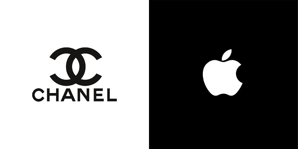
Chanel
Chanel’s black-on-white logo is the refined essence of luxury. It stands for minimalism, harmony and grace, reflecting Coco Chanel’s own “less is more” philosophy. Karl Lagerfeld echoed that view, commenting: “Black-and-white always looks modern, whatever that word means.” The colour pairing communicates timeless elegance and high-end design without distraction.
Apple
Apple’s visual language champions minimalist design. Its use of white space, paired with black or grey accents, speaks to clarity, innovation and craftsmanship. A turning point was 1988, when Apple replaced its rainbow logo with a solid black version, reinforcing sleek sophistication over colourful novelty. This aesthetic remains central to the brand’s modern identity.
Colour Palettes (Colour Theory)
Colour palettes shape how a brand feels, they aren't a random collection of tones but a calculated mix. When you group or contrast colours deliberately, you guide mood, focus, and perception. Below is a sharp breakdown of the main palette types and what each brings to your brand design.
This is your starting point: the colour wheel. Invented by Isaac Newton in the 17th century, it arranges colours in a circle — primaries, secondaries, tertiaries — to show how they relate. Colour theory teaches us how to combine these hues in ways that feel harmonious or striking. Use this wheel to guide every palette decision.

Analogous
Colours side by side on the wheel (like blue, blue‑green, green) create a smooth, calming flow. The result feels natural and harmonious, ideal when you want gentle cohesion.

Monochromatic
Uses variations of a single hue - tints, tones and shades (view next section), to achieve visual harmony. This approach feels sleek and refined, though relying on subtle contrast or texture is key to prevent flatness. Excellent for clean, minimalist design.

Complementary
Colours directly opposite on the wheel (e.g. blue and orange) deliver bold contrast and vibrancy. This strategy grabs attention fast, but can feel harsh if overused.

Triadic
Selects three hues evenly spaced around the wheel, forming a triangle. It yields balanced yet vibrant palettes - playful and energetic without chaos.

Tetradic (Rectangular)
Combines two complementary colour pairs, arranged as a rectangle on the wheel. This scheme offers rich, dynamic visuals, but it needs one dominant colour and careful balance to avoid visual overload.

Square
Uses four colours evenly spaced to form a square on the wheel. It offers both contrast and harmony. To stay visually coherent, designers should pick one dominant colour and use the others sparingly as accents.

Hue, Tint, Tone, Shade
Knowing the difference between hue, tint, tone and shade sharpens your colour choices. Each variation carries emotional weight, mood, and perception shifts. Understanding them makes your brand speak with intent.
Hue
A hue is a pure, unaltered colour — like red, blue, or green — before any white, grey, or black is mixed in. Value brands often stick to bright, straightforward hues to feel affordable and accessible. According to colour theory, hue is the foundational colour family. Brands use these variations strategically.

Tints, Tones, and Shades
These are more complex colour variations, each adds nuance and depth, often favoured by premium brands.
Tint:
A tint is a hue lightened by adding white, producing a paler, often pastel version. Pastel colours are especially popular with Gen Z. The Soft Girl aesthetic, a trend rooted in TikTok culture, heavily uses pastel shades, such as baby pink, lavender, mint, and powder blue, to create a gentle, approachable look.

Tone:
A tone is a hue muted by adding grey, reducing its saturation and creating a softer look. Muted tones don’t compete, they guide. Design analysis shows that soft, muted palettes evoke calm and ease fatigue, making them ideal for wellness, nonprofit, and lifestyle brands seeking subtle emotional resonance.

Shade:
A shade is a hue darkened by adding black, resulting in a deeper, richer version. In luxury branding, shade translates to depth and distinction. Deep shades, especially of black, gold or rich neutrals, bring sophistication and authority. They help premium brands signal quality and timelessness.

Conclusion
Colour is a part of the story your brand tells. You’ve seen how pure hues speak to affordability and clarity, while tints, tones, and shades offer nuance and emotional depth. Choosing your palette starts with knowing who you’re speaking to and what you stand for. From psychology and to theory, colour works on people before words ever do.


Comments